USA PEARS REBRAND
Evolving A Legacy
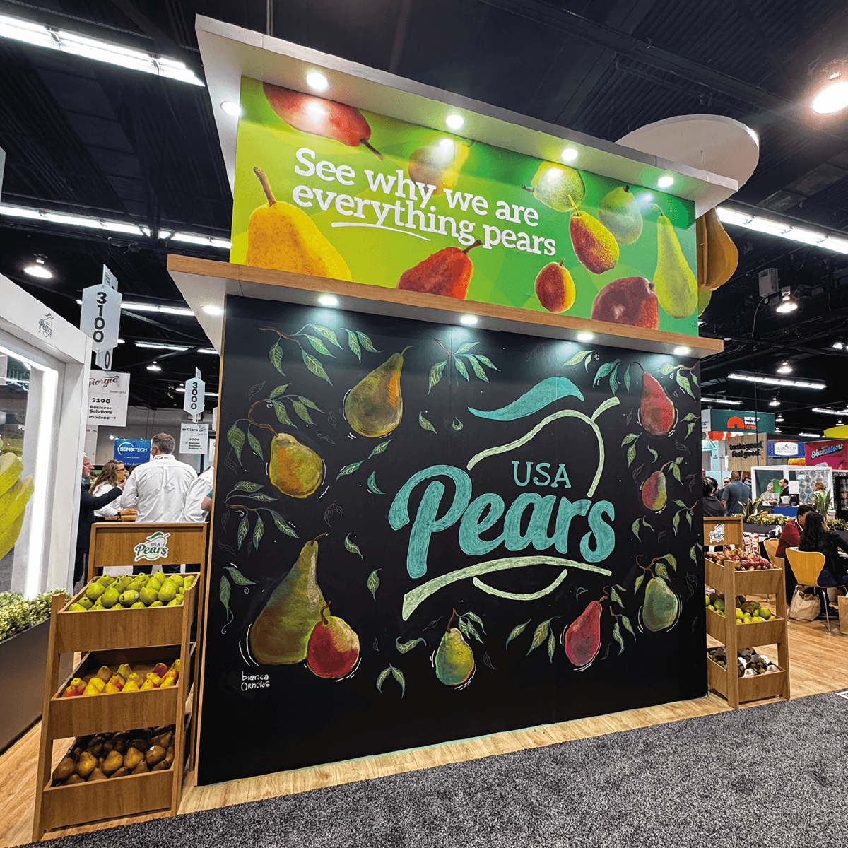
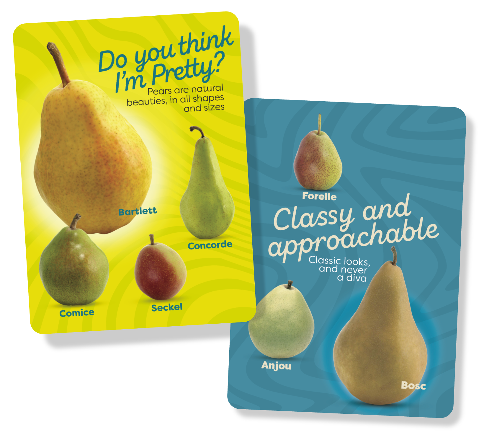
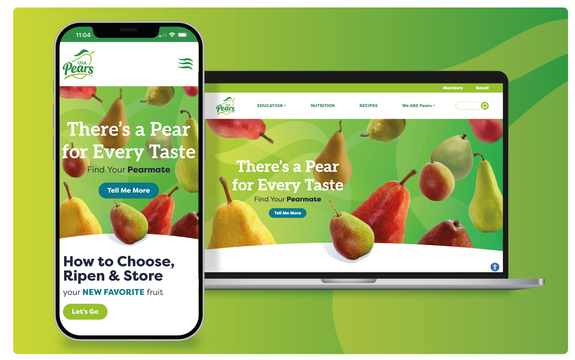
How do you evolve a legacy brand representing over 700+ growers and 30+ packers while staying true to its roots? By blending authentic storytelling with modern design. For USA Pears, we refreshed their identity to communicate that a pear is more than just a fruit—it’s a reflection of care, craftsmanship, and community. The new system introduces a confident mark, a streamlined color palette inspired by Pacific Northwest orchards, and clean, versatile typography. Beyond visuals, the updated tone and messaging bring the growers’ stories forward—connecting today’s consumers to the heritage, quality, and sustainability behind every pear. The result is a brand that feels both timeless and fresh, ready to reintroduce the pear to the world as the fruit that grows with purpose.
Results
+ IFPA 2025 October Launch
What We Did
Brand Strategy | Identity Design | | Asset Creation | Copywriting | Web Design


more work
Let's talk about you
Have questions or need to get started?
Send us a note. We're ready to go!


